Dashboards
Compose your own view: drag widgets onto a canvas and pin each one to an identifier, detail identifier and time range. Saved per credential and restored exactly as left.
- Drag from a palette onto the canvas, then drag to reorder and pull to resize — width in columns, height in pixels.
- Each widget carries its own query: a relative or absolute range, the summary per step — average, minimum, maximum, sum, count, median and percentiles (P05–P99), spike envelopes, standard deviation, first/last/consumption for meters, or data coverage — the size of each step along the axis, a result cap and a refresh interval.
- Charts take several series at once, each with its own identifier and colour.
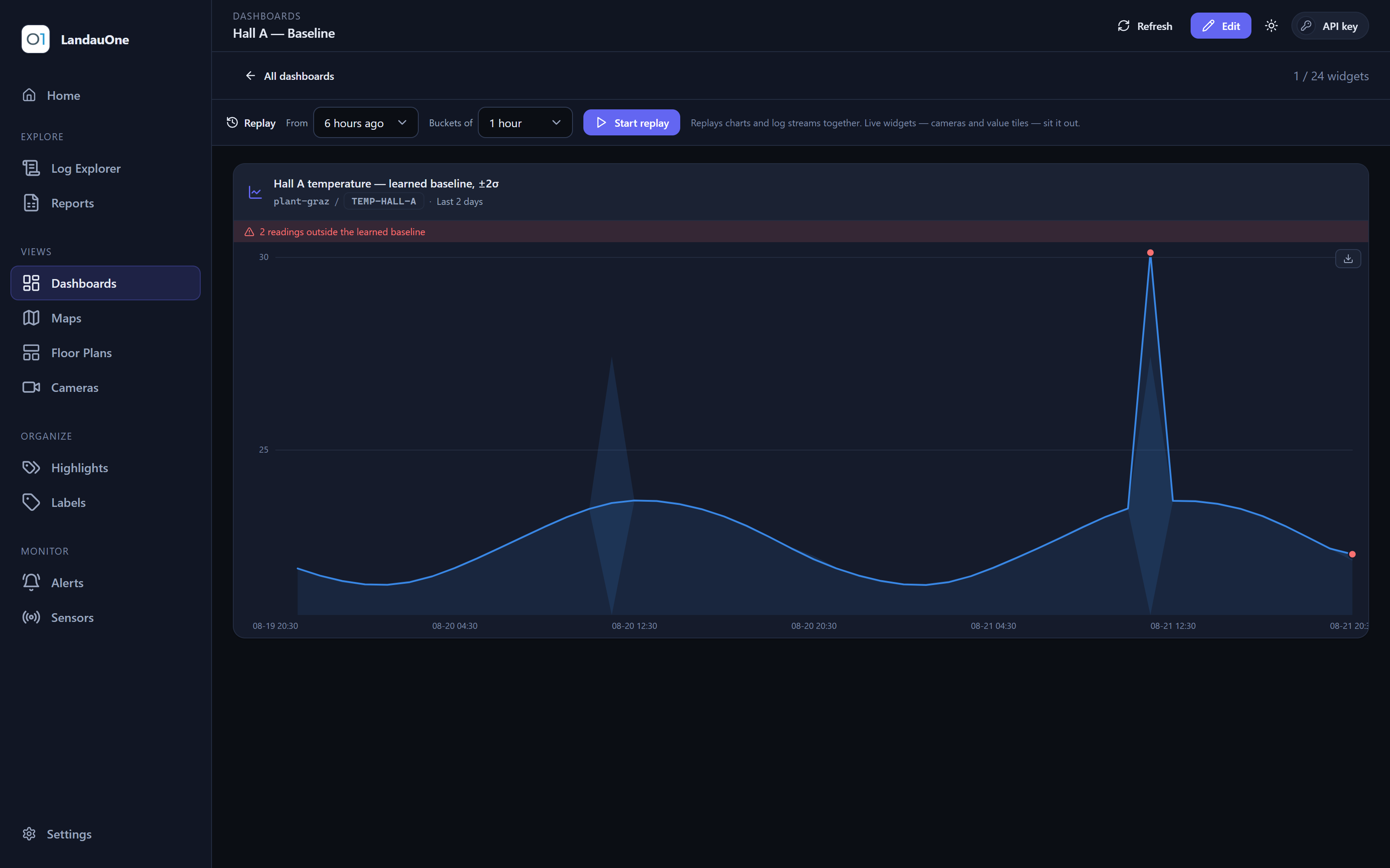
- Bands — shade a min–max envelope or ±2σ around each series, or a learned baseline: the chart studies the last two weeks of each hour of day, shades what normal looks like, and flags every reading outside it.
- Compare — overlay the same series from the previous day, week or 30 days as a ghost line, so “is this normal for a Tuesday?” is answered by looking.
- Any chart exports what it is showing as CSV, exactly as zoomed.
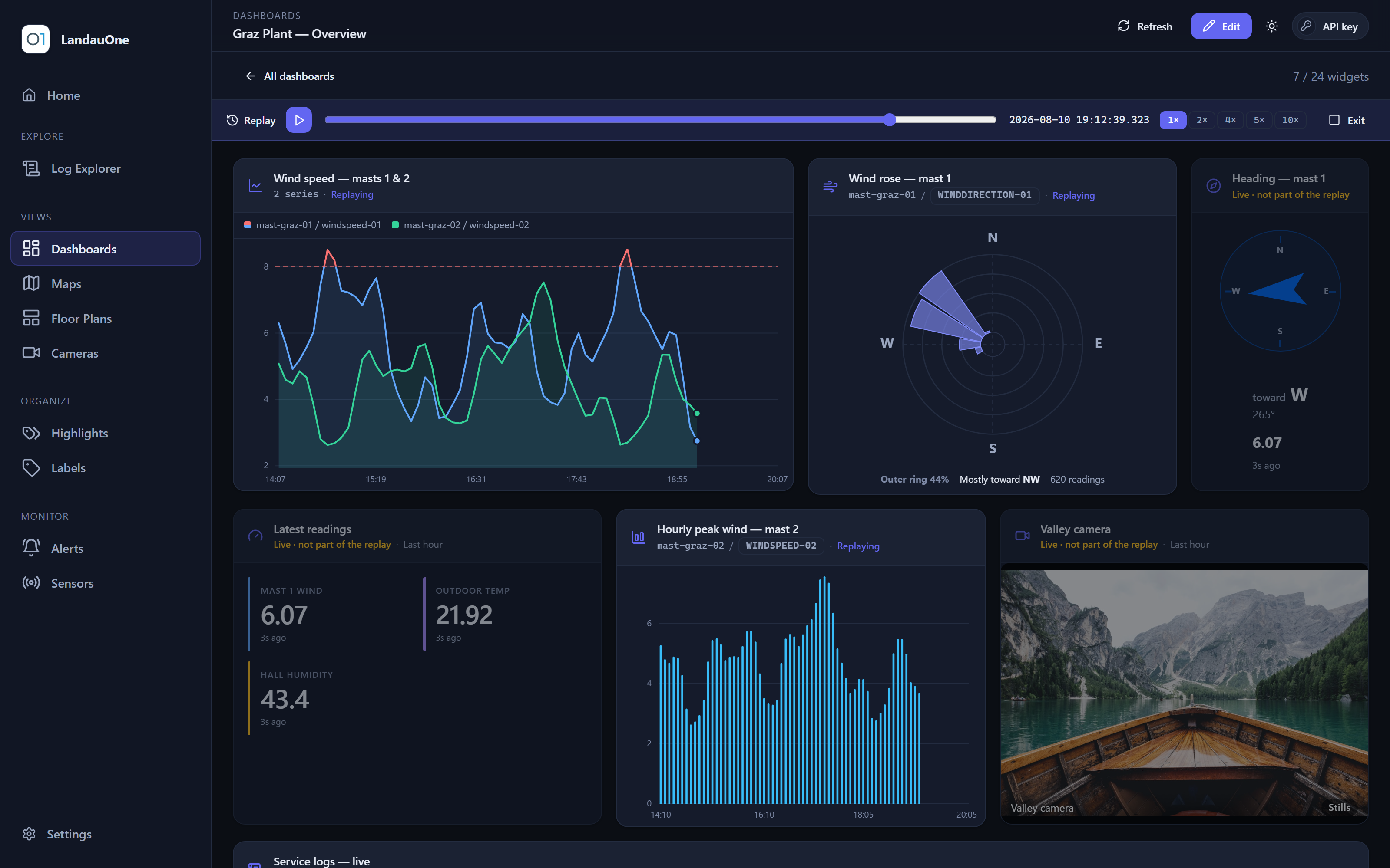
- Replay — scrub a time range and every widget that can replay follows it together.
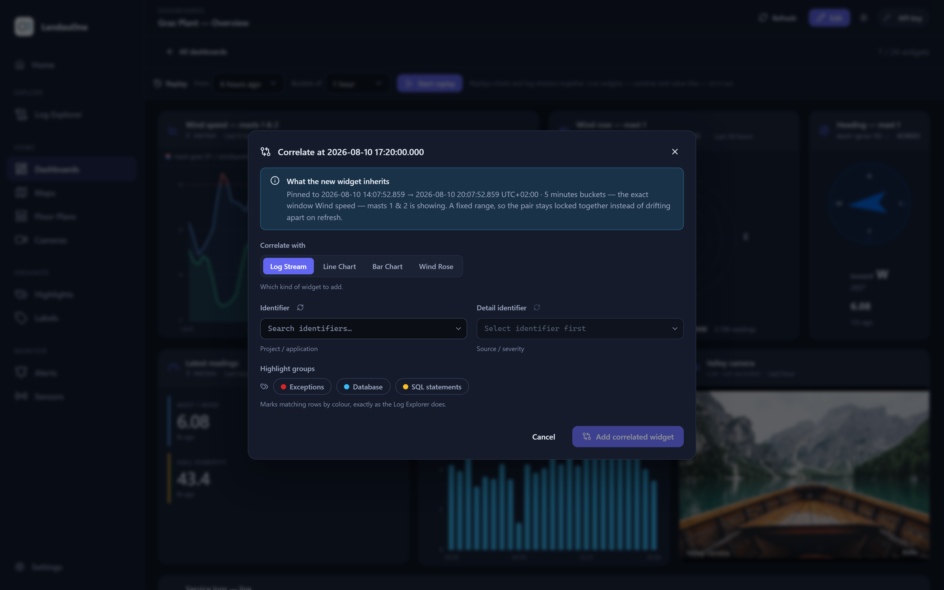
- Correlate — put series side by side to see whether two things really move together.
- Bearings get their own widgets: a compass rose and a wind rose, because a direction averaged as a plain number is nonsense across the 0°/360° seam.
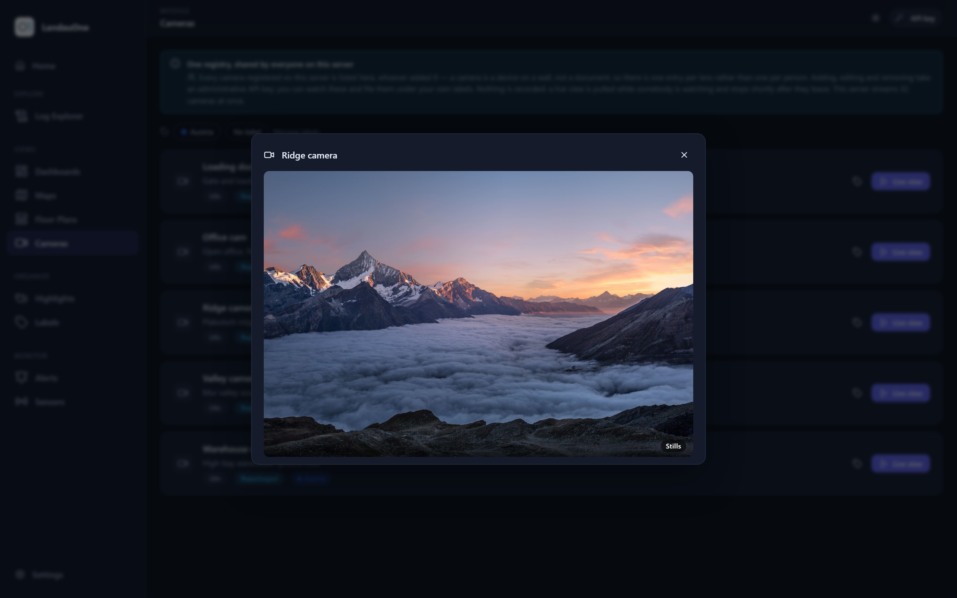
- A live camera is a widget like any other, so a feed sits next to the readings it explains.
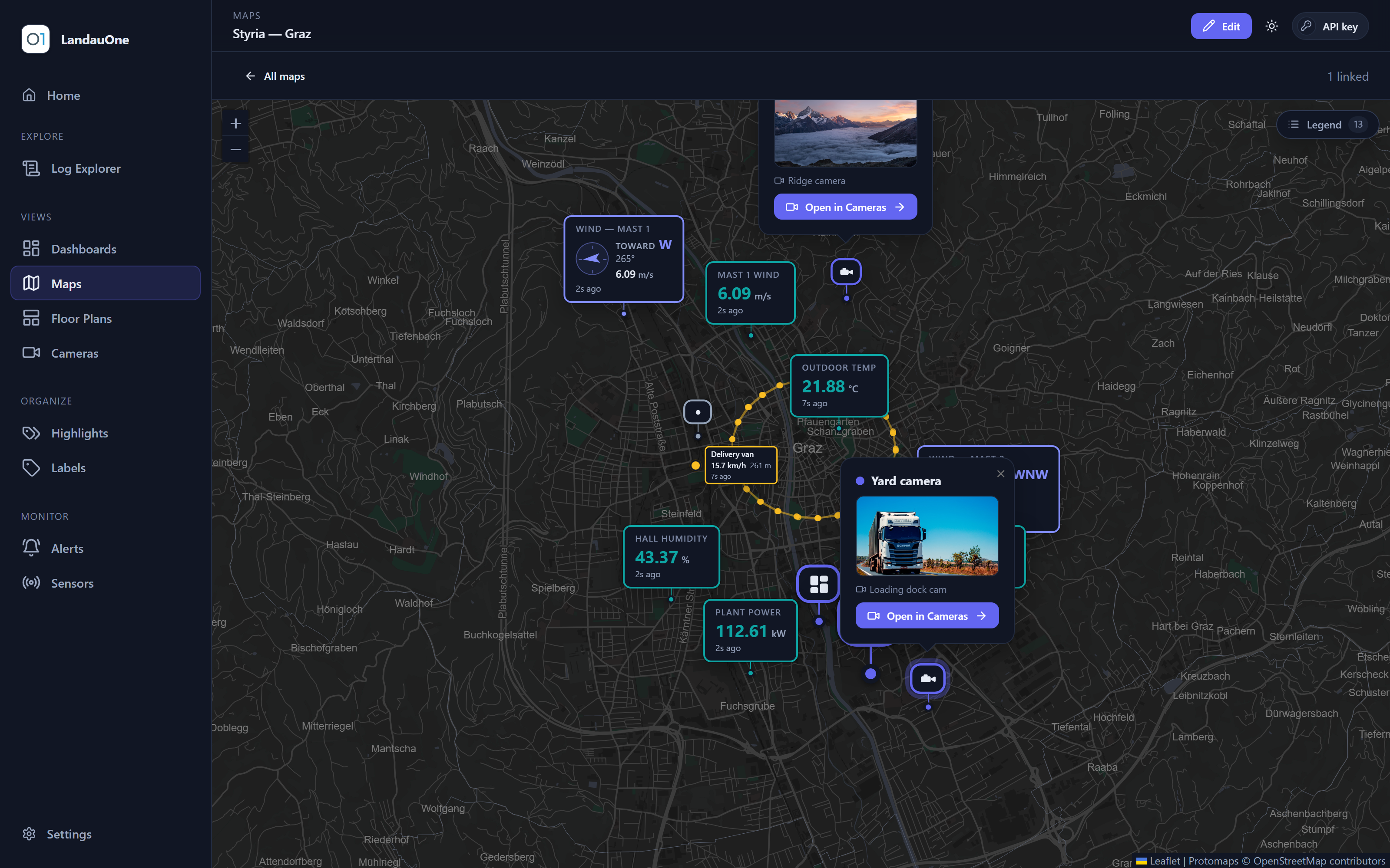
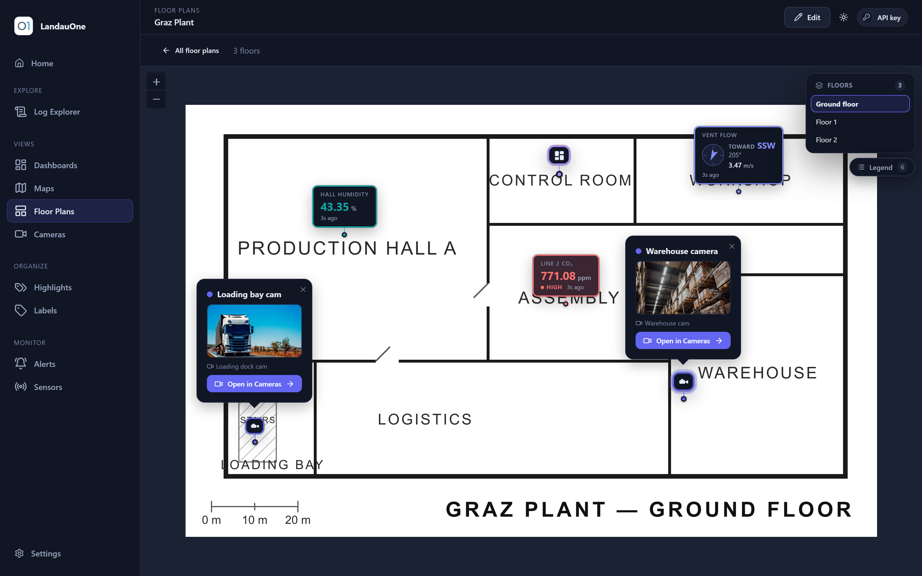
- Filed under your Labels, shareable read-only, and openable straight from a Maps pin or a Floor Plans marker.
- Log markers — the asset's own error and warning lines drawn as ticks along the chart's timeline, so a reading is read next to what the machine said at the time.